
Unparalleled visibility of your software landscape
Trusted By


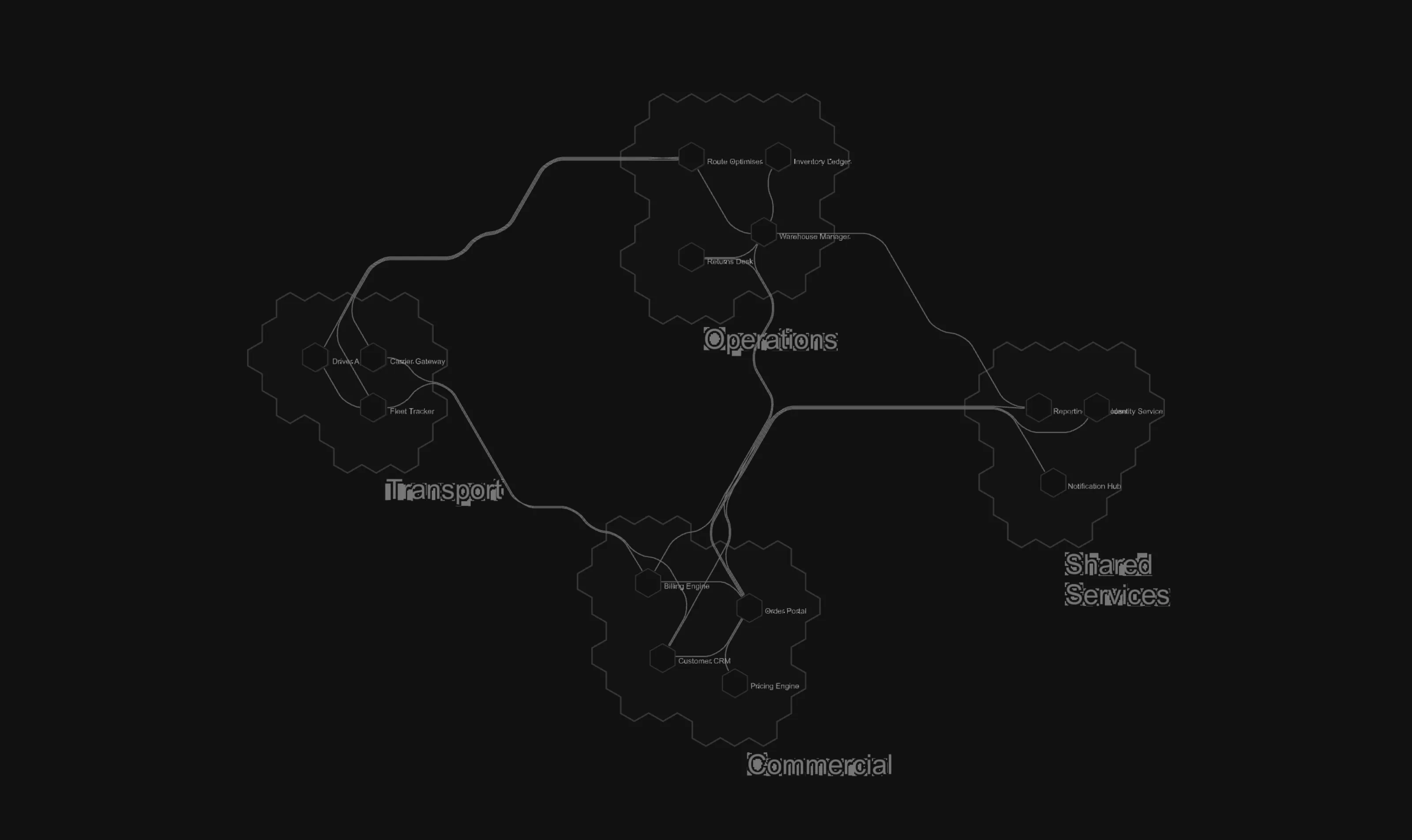
A software map pins every system to a stable place, so your whole organization can learn the landscape the way it learns a city.
Any data
Your estate, as it actually is
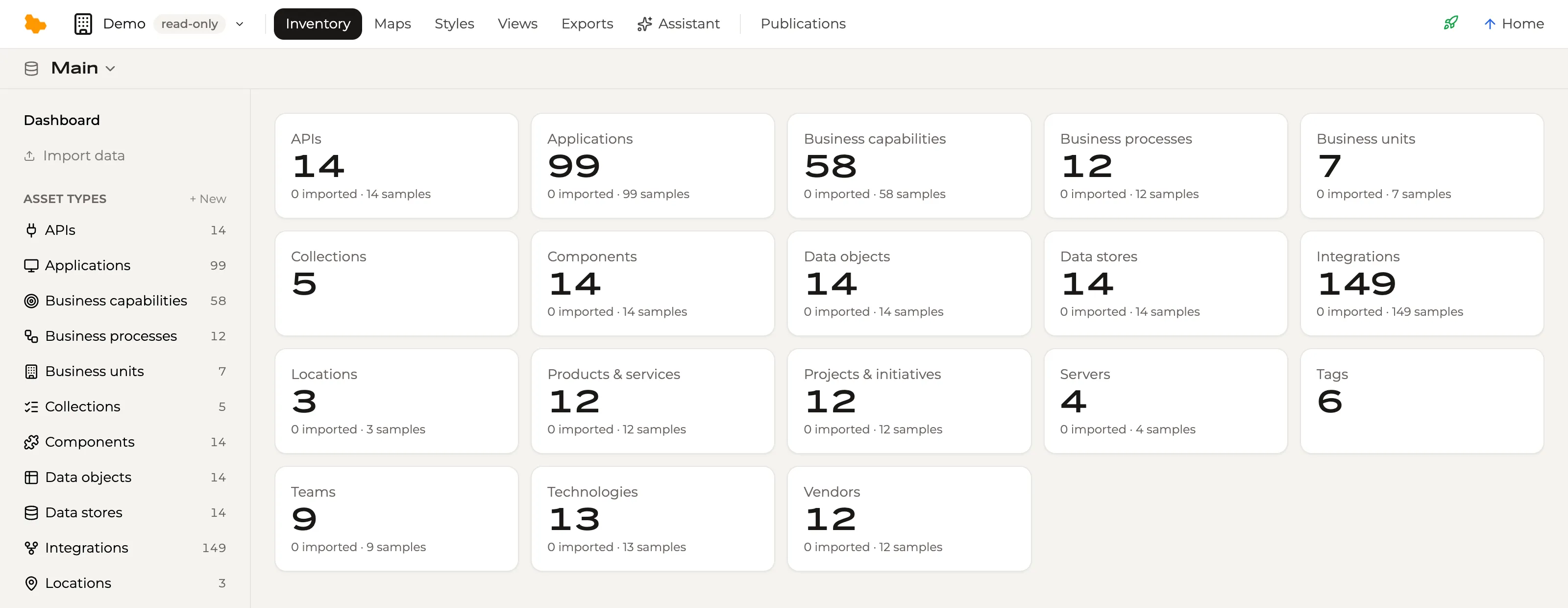
An inventory with asset types you define — applications, integrations, components, business capabilities, teams, data stores, vendors, and whatever else your organization runs. Drop in a spreadsheet or a paste and the AI proposes the asset types, fields, relations and assets; you check the proposal and confirm it. Nobody starts from a blank schema.
Any view
Six ways to look at one inventory
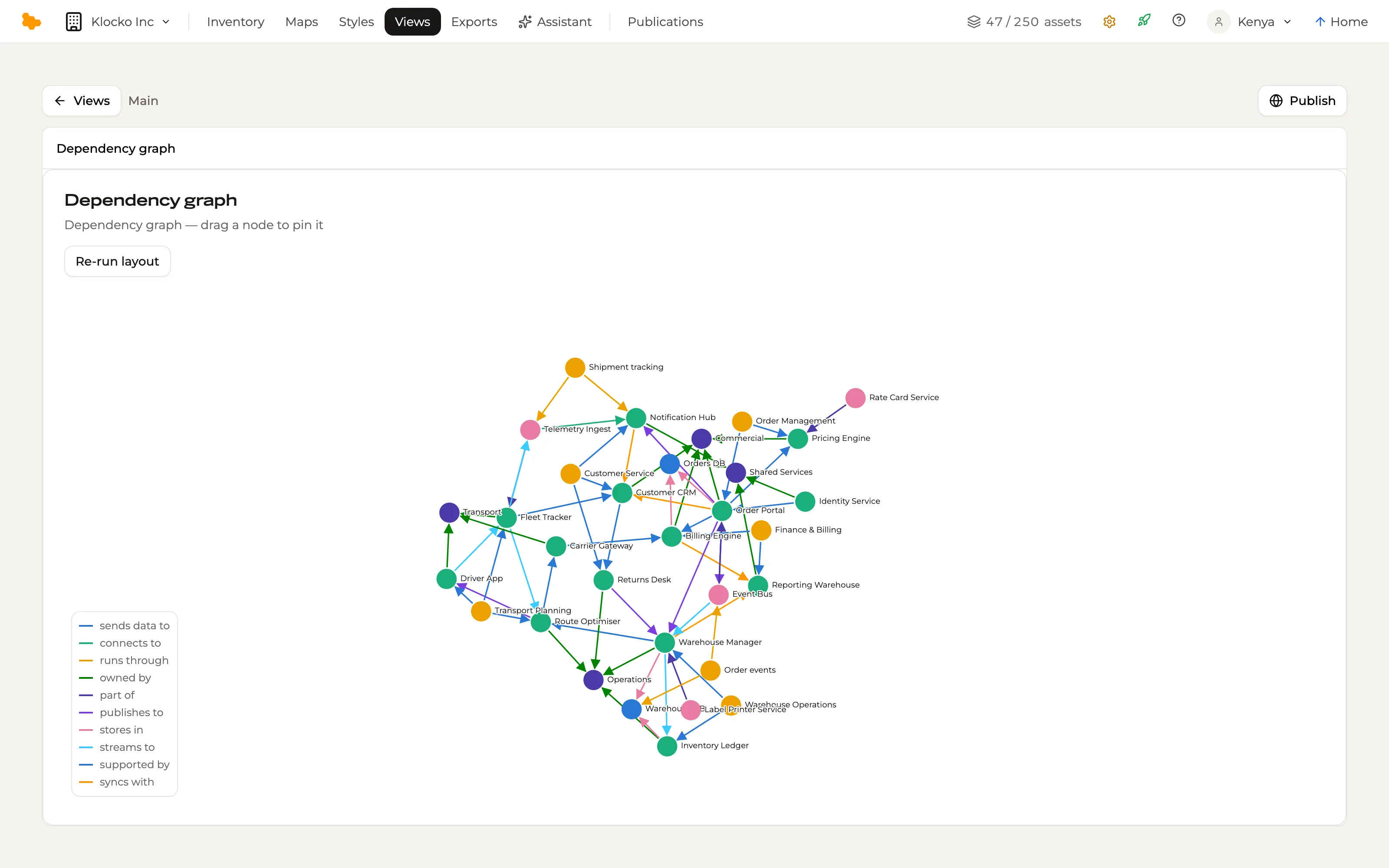
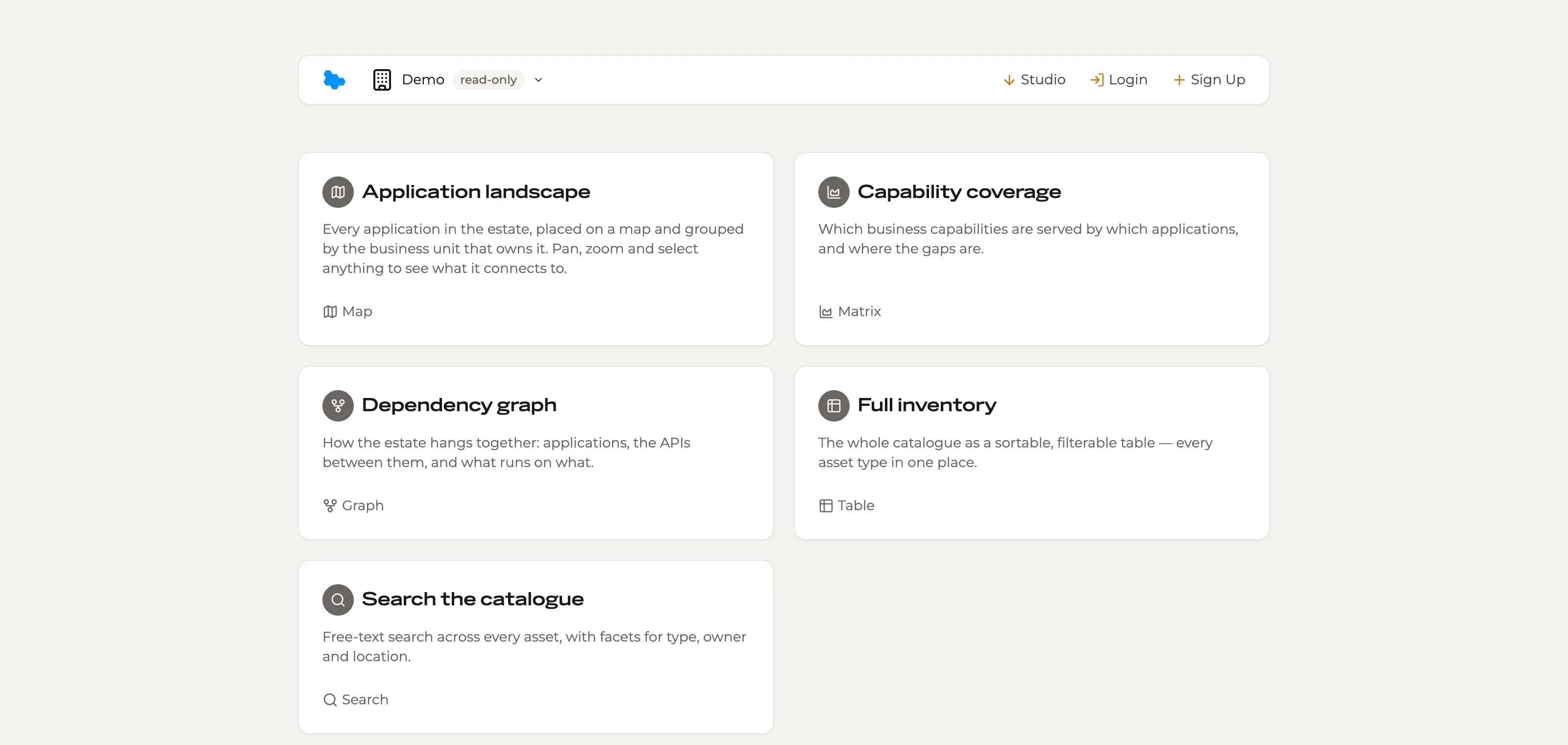
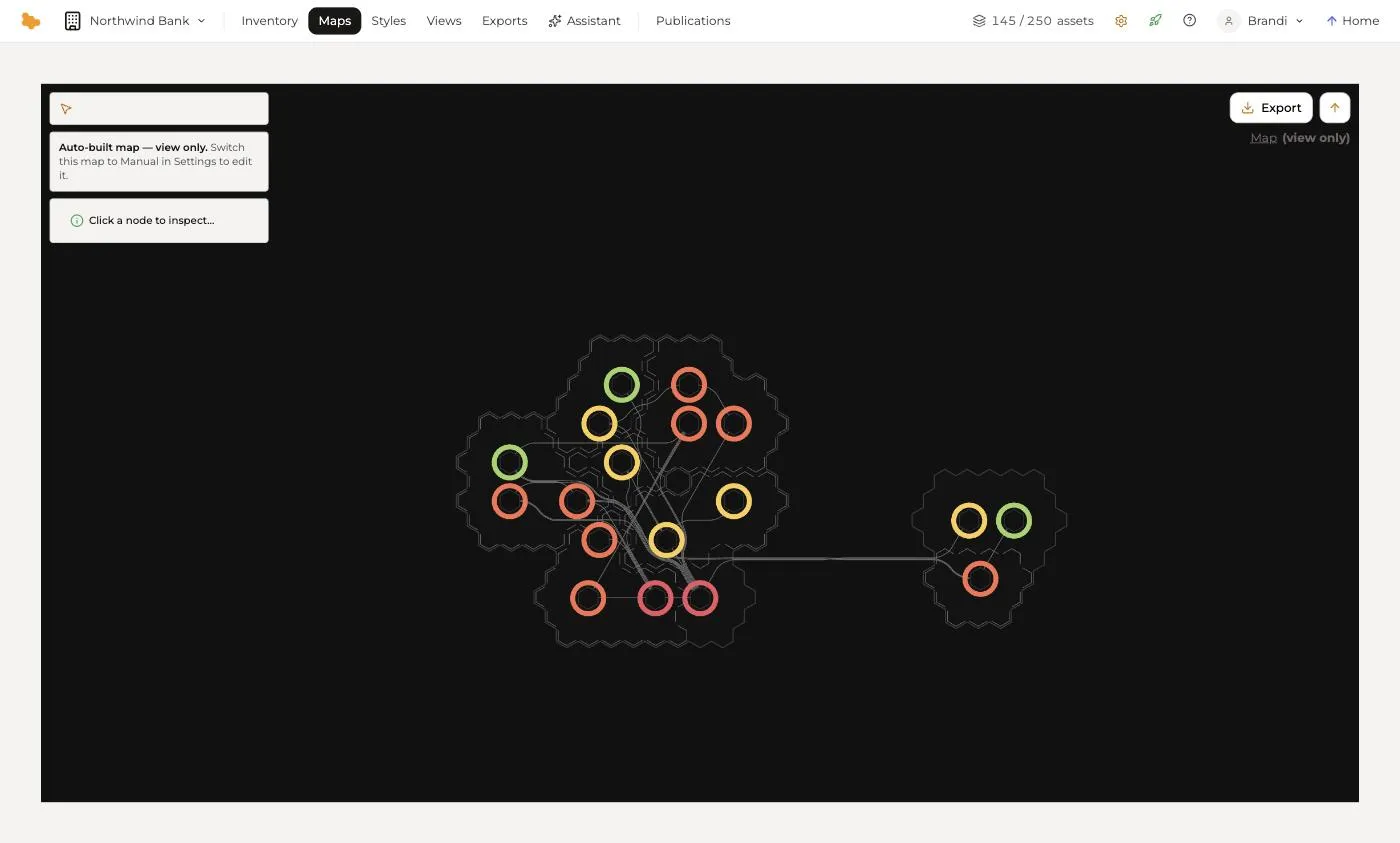
The same assets render as a table, a matrix, a graph, a Flow, a map or a search — and a saved set of filters and columns is itself a view. The map is the signature: every asset pinned to a stable grid so the same thing is always in the same place, and people learn the landscape the way they learn a city.
Tell the story
One map, many styles
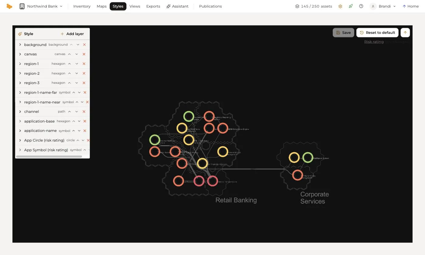
A map can carry several styles, each telling a different story on the same geography — risk, cost, hosting, lifecycle, the reach of a programme. Colour by any field, give a relationship type its own colour, and the picture updates as the inventory does. You never redraw a diagram.
Publish
A URL for every view, for the people who need it
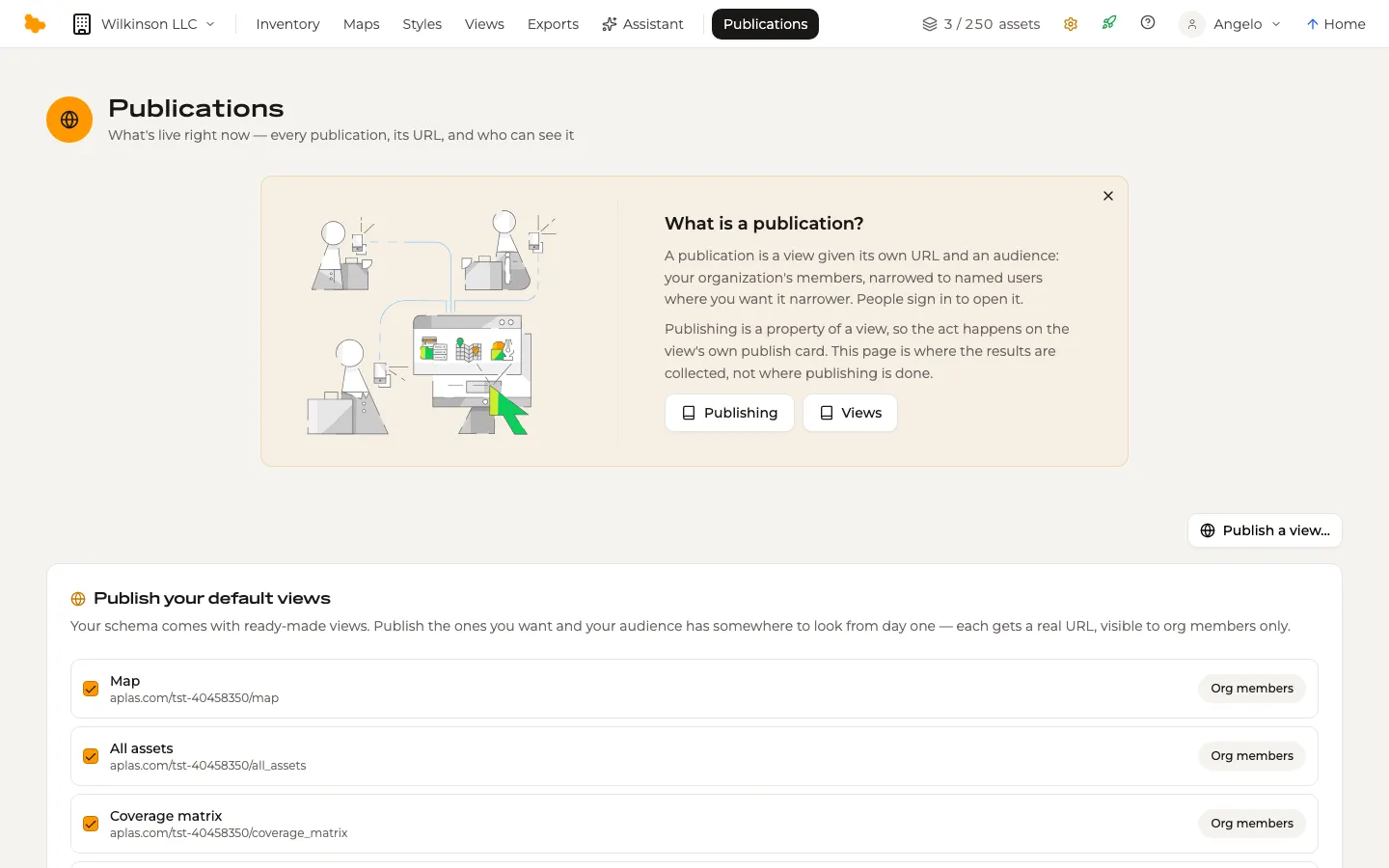
Publishing is an act on a view: give it an address under your organization and an audience — your organization's members, narrowed to named users where you want it narrower — and it stays in sync with the inventory. Ask the assistant a question about your systems, or bring your own tools over the REST API and the MCP server.
Testimonials

Aplas is REA's key product to make sense of our microservices web. As the number of systems, integrations, teams and products increased our ability to understand our ecosystem decreased. With Aplas we now can visualize our digital ecosystem allowing us to make better decisions and effectively manage technology evolution. Aplas has a flexibility that perfectly accommodates our metadata, allowing systems plotted on the map to carry valuable information. This information is used by delivery, business and product people alike.
 Daniel AragaoREA Group Lead Architect
... We're pretty excited to see this product evolve and to see what's possible with the automated collection of metadata. It should be possible, for example, to expose architectural fitness functions such as run cost to create visualizations of how much is being spent on cloud infrastructure. Understanding which systems talk to other systems via which technology is another problem we often face and Aplas can visualize it for us.

Aplas provides us with visibility across our entire IT Portfolio using a language that reduces complexity and risk of our SaaS and traditional IT investments. With this tool we can describe how our platform works to business, IT security and risk teams.
 Tom LeydonGlobal Leader ITRead the Woods Bagot story
Understanding Aplas
From a spreadsheet to a published map, in four steps.
Bring your data
Start with what you have
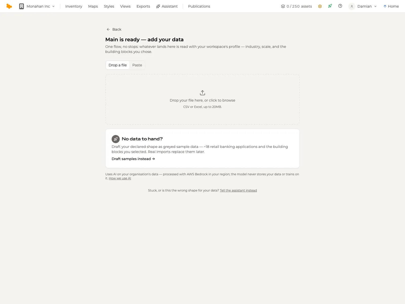
A CSV or Excel workbook — several sheets are fine — or a paste straight out of a spreadsheet. No template to fill in first and no column-mapping screen.
With nothing to hand, Aplas drafts a sample estate for your industry and scale, badged as samples for you to correct or clear in one action.
AI models it
A proposal, not a schema project
The AI reads your data against your workspace's profile — industry and scale — and proposes the asset types, fields, relations and the assets themselves.
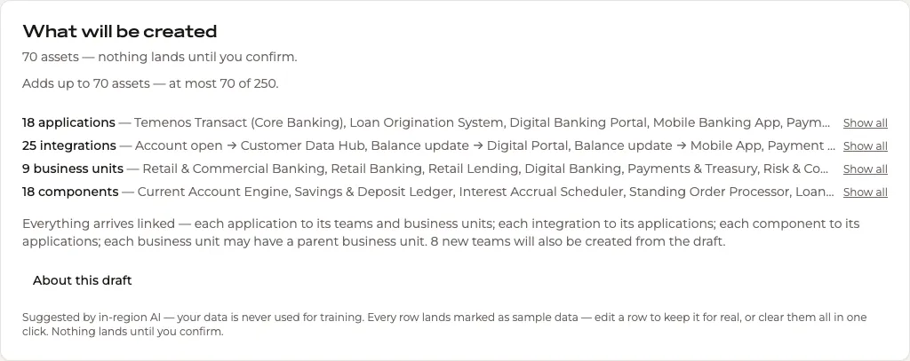
What will be created is laid out for you to check: a count per type, how the assets will be linked, and the assumptions the draft used. Nothing is written until you confirm it.
Views and maps
Look at it every way you need to
Open the inventory as a table, a matrix, a graph, a Flow, a map or a search. A view is a lens on the same assets, not a copy of them, so it is never out of date.
The map gives your estate a geography: assets pinned to a grid, grouped into regions, joined by the roads between them — and styled for each audience.
Publish
Publish to your organization
Every view carries its own publish card. Give the view a URL under your organization and an audience — your organization's members, or named users among them — and it is live.
Publications lists everything that is live across the organization: each view, its URL, and who can see it.